Archive

Monthly Archives: February 2013

After looking into the artist Thomas Quinn and being inspired by his almost flawless typography I decided to take a shot at doing it myself, here’s my progress throughout the experiment.

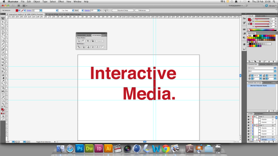
The way I planned out how to achieve this was through the use of a projector, paint, illustrator and some creative drive. I first used illustrator to come up with a design that I would be best to use, I used typography but images can be used with this technique also (it just takes more time, effort and skill).


Screen shot 2013-02-28 at 10.08.37

Then I exported the image as a .png so I could use it later for the projection process.

Nice and transparent :)

Nice and transparent 🙂

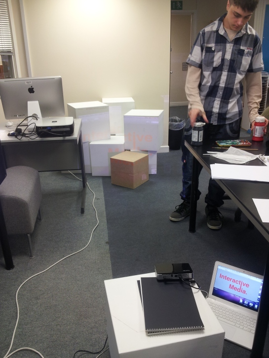
I set up the projector so that it would project the image onto a stack of boxes arranged in a way that looked asymmetrical, the idea here is that you project the image at the height the user should be perceiving the final (for my experiment I placed the projector low so that the image could be seen without looking in an awkward angle but would seem quite distorted from above).
20130228_105035

This step would probably be best to do this with the lights off as the projection can be seen clearer.

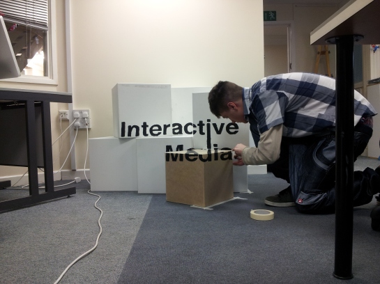
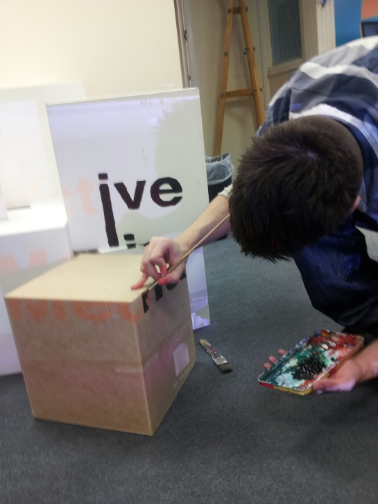
Once the projector is in place the image needs to be traced like a stencil.
20130228_111312

Tracing the image proved difficult as the projection was blocked by myself due to hard to get places.
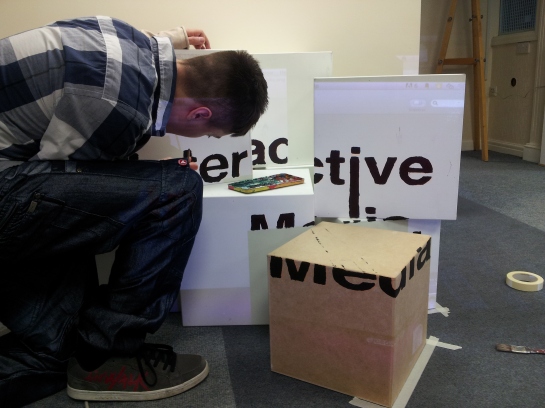
20130228_114603

Another thing to note is that keeping lines straight when drawing from difficult stances is extremely hard.

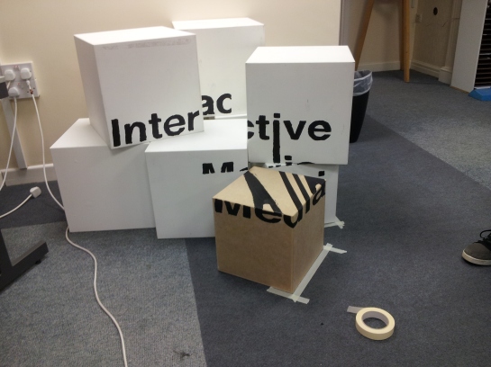
Nearly done

Nearly done

When looking from above

When looking from above

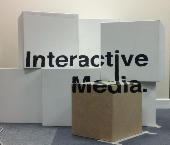
final

final

A few things I should note about the project, I really did enjoy doing this experiment but I will say that amongst the fact it looks alright as an end product I would change a few things now that I have attempted anamorphic typography.
The first thing I would of changed about the way I accomplished this would be the way I projected the image, the projection was at an extreme angle but it was an observable angle (the image could still be made out because the projection was made with a high pitch angle but hardly any yaw) this resulted in an image that could be made out from the front view without having to stand (or sit) in the position intended to observe the artwork.

The second thing I would change would definitely be time, this experiment was elapsed over the space of 4 hours making almost no room for error.

In comparison to Thomas Quinn’s anamorphic art, my work really lacked the definition he used within his piece mainly due to the fact I had a very small amount of time but also due to the difficulty of painting over a projected image.

Other than those things I would say I’m really happy with the way this turned out, I will definitely try this again taking the problems I encountered into consideration for the next try.

thomas2

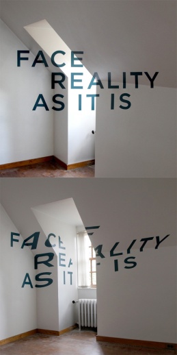
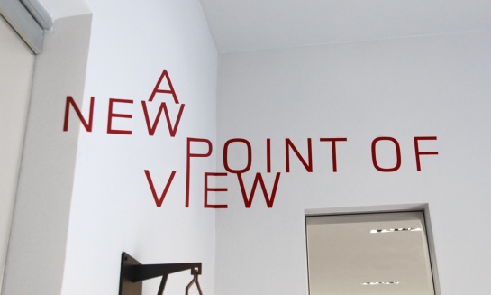
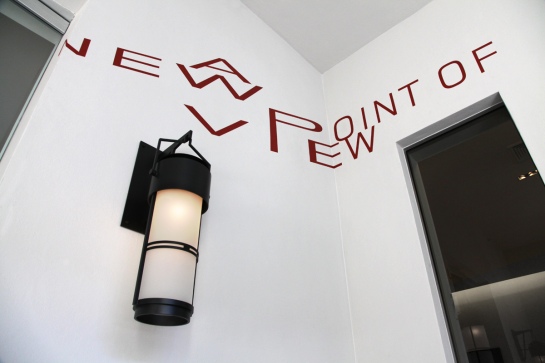
Looking at the artwork above it would look almost normal at first glance but seemingly like it couldn’t exist within the 3D space it inhabits, the image below shows exactly how it was achieved by using an artistic technique known as anamorphosis. Within Anamorphosis there are two main types that exist, perspective and mirror. Perspective anamorphic images were first seen back during the Renaissance (15th Century) as for mirror anamorphic images they were first seen around the early 16th century.

Thomas Quinn uses perspective Anamorphosis to make simple typography almost magically appear out of thin air, looking at the image from a different angle you can clearly see how the typography was painted onto the walls in a way that displays the final image but only from a specific angle.

thomas4

thomas5

Thomas Quinn is a graphic designer living in Chicago Illinois and also the principal designer at Blank Is The New Black a creative studio that keep’s an eye on new trends in design, but always choose’s smart design over fashionable design. The designer uses many different types of art to create illustrations and typo-graphics in simplistic yet smart ways.

After looking into some of his artworks I’ve become inspired to make some anamorphic typography similar to the style of Thomas Quinn.

thomas3


Just a few quick sketches to warm up, been studying into figure drawing the past few days and it seems to be helping quite a bit with drawing characters. If you find yourself going on the same journey I suggest looking into Andrew Loomis figure drawing, his books have great detail about proportions and manikins. Here's a good place to get them, and they are 100% free too ! http://www.placidchaos.com/AM/index.php/2006/02/21/andrew_loomis

Selective perception – process by which individuals perceive what they want to and disregard the rest.
Please leave a like, comment and subscribe!
How it was done-
This short film was made using Battlefield 3 and After Effects CS6, It took around 2 weeks to complete this short cinematic film.
Not because of the difficulty of shots, but the difficulty of setting up the shots.
Each scene was an image sequence recorded at 0.4 frames a second allowing for it to be played back in post at 24 or 30 fps ect resulting in a time lapse of a game.
This meant each clip needed to be recorded for a certain amount of time in order to get a specific amount of footage.
So 9.6 seconds of image sequence would make 1 second of footage (0.4 x 24fps = 9.6).

On top of all this Dice released the aftermath patch which disabled the ability to do the no gun glitch, soo I spent a good few days trying to find a way to do it without taking too long.
Found one method, but it’s ridiculously hard, if you guys want/need a tutorial for it throw me a comment saying so.
I’m sure you guys are bored out of your minds reading this, but if you did. Thanks.

Music is – RLM Gold Dayz (Maribou State remix)

Figure drawing practice, I've been starting to draw digitally since I acquired a digital tablet that has a working pen in order to push my skills more towards character concepting, I have a background in traditional art but haven't drawn in a long time due to converting from paper to pixels. I hope other people have gone through the struggle of transferring their skills from traditional Art to Digital and it's not only a phase that I myself am going through. Here are some of my Figure drawing practices over the space of a couple of hours the other day, for some reason I felt a spark of creativity and wanted to tackle the thing I find the hardest, Drawing figures. [caption id="attachment_78" align="alignnone" width="600"]Figure drawing_4mins Figure Drawing 60 seconds twice over for each character, showing shadow value[/caption] [caption id="attachment_76" align="alignnone" width="253"]Figure painting1 Quick painting test[/caption] [caption id="attachment_77" align="alignnone" width="386"]drawing practice1 Figure stances and lean pose's[/caption]

RUIN – An animated short set in a post-apocalyptic universe. It’s only a tiny sliver of a much larger story. Thankfully, it’s now set up at 20th Century Fox to become a full length feature.

An awe inspiring film made by a small studio specializing in 3D animation for cinema, It is predicted that FOX has been negotiating with the team in order to pre-emptively pick up the movie rights to Ruin. 

I am certainly looking forward to seeing where Wes Ball takes this with FOX on board!

If your looking for more info you can find there page here > facebook.com/ruinfilm